How we leverage customer insights for a more impactful experience
Inside YC
Back to blog
Sarah Paterson
February, 8 2024

Inside YC
On this page
In the fast-paced world of digital money, understanding your customers is key to driving meaningful impact. In this article we dive into best practices that Yellow Card has employed to harness the power of customer insights.
Share this article
Just like a compass provides direction and guidance, customer feedback and insights guide a business in the right direction. The Design & UX team at Yellow Card prioritise our customers (that’s you!) and put them at the forefront of all our design decisions.
If you are unaware of what Design & UX does, at Yellow Card we’re a multidisciplinary team consisting of Product Designers, Researchers, Writers & Illustrators. We own the full experiences of our products to ensure all our customers experience a seamless journey with us. Our Mission is:
“We design to impact our customers’ money moves, by creating the most intuitive, delightful, educational, data-driven financial product in Africa.”

While many may think that designers ‘make things look pretty’, that couldn’t be further from the truth. Our aim is to make the biggest impact on customer satisfaction, and to make sure we’re creating products that alleviate any friction and encourage an enjoyable experience. This isn’t just about having a pretty User Interface, it comes down to the way our customers behave within our products, how we guide them to complete activities in the ways that make sense to them. This is where we utilise customer insights to guide us in the right direction.
I’m sure you’ve interacted with apps before that were so frustrating to use, where the navigation was difficult to understand, or perhaps you couldn’t find your way around the app to complete the activity you intended on when downloading the app. I’m willing to bet you immediately quit that app and never opened it again, right? This is what happens when businesses do not prioritise customer insights, and rather prioritise pushing out new features with no understanding of their customers’ wants, needs, and pain points. This is why we at Yellow Card work tirelessly to understand who our customers are, so we can build a product that satisfies our customers wants and needs, and alleviates those frustrating pain points.
So how do we gather customer insights?

There are multiple quantitative and qualitative methods we use to regularly gather customer insights, such as:
- Surveys & interviews
We most commonly use these methods when we’re conceptualising new features to get a feel for customers' sentiments about the feature. Depending on what the new feature or idea is, we survey or interview a specific cohort of customers who would be most impacted or have the most knowledge about that feature. This could be customers in a specific region or age group, as examples. - Usability testing
We utilise usability testing when we have a proposed solution designed. Usability testing is often conducted with a segment of customers where we sit down with them for an hour and ask them to complete certain tasks on the new feature. We ask them questions such as if the feature will be an added improvement to their Yellow Card experience, and note any areas where they get stuck within the flows. We then use these golden nuggets of insights to further improve the feature before we hand it over to engineering to build. - Listen to the data
It’s best practice to marry up the qualitative data (what customers actually say) versus the quantitative data (what actions the customers actually take). Often we’ll use our data to spot areas of improvement. For example, if we notice a drop-off during a particular flow, we will use that data to investigate further with our customers, such as finding out the reason behind why the drop-offs tend to happen. Once we understand the ‘why’ we can then ideate an improvement which will then again be tested with customers for feedback, before implementing the improvements. After which, we’ll then lean on our quantitative data to measure the improvements’ impact.
That’s great, but how do we use this in practice?
Allow me to take you on a journey, or case study if you will, of how the Design & UX team directly impacted our customer experience by truly listening to them.
Our team embarked on a journey to uncover what our customers' intent was when downloading our app. We conducted many rounds of surveys and asked specific questions of our customers to uncover their intention with us. We received an overwhelming response from thousands of customers which enabled us to dive deep into the data and use the insights to create personas. From this, and further research projects, a recurring theme surfaced; our customers were in desperate need of more education in the crypto space.
Our customers' intent was clear. They wanted to join the new financial movement and ‘get crypto’, but they just didn’t know how.
These insights were so valuable to us in the Design & UX team and we knew we had to get all hands on deck to solve this problem for our customers. So we decided to conduct a “designathon” (a design hackathon) where the whole team got together to ideate what improved education in our app could look like.
Enter the "Nudge" project.
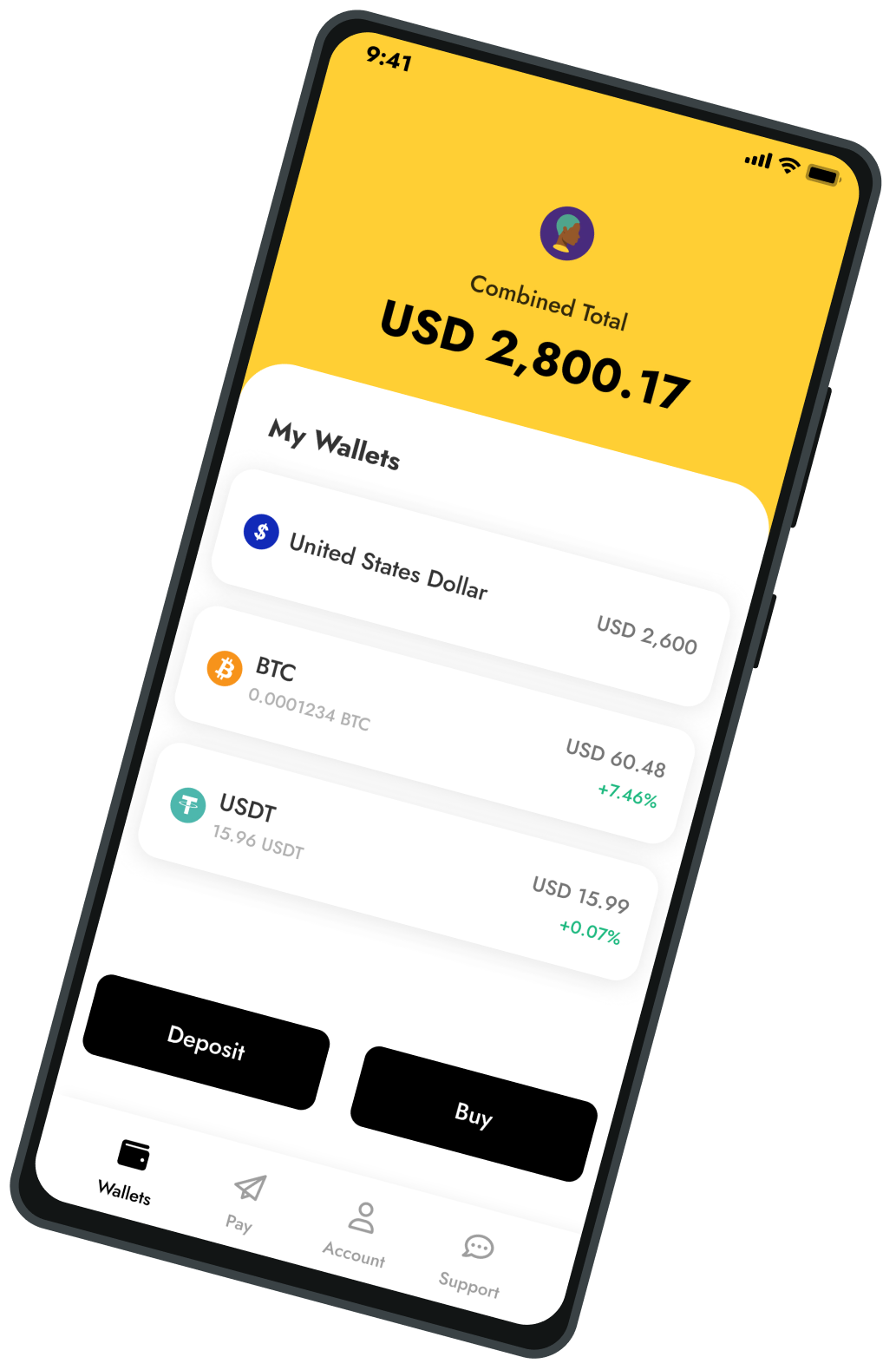
We realised that for a newbie trying to “get crypto” there tends to be a steep learning curve. Customers need to create their account, then deposit their local currency before they can go on to buy the coin of their choice, then how do they make an informed decision on the coin they should buy? All of these steps can be overwhelming to new customers. The Design & UX team came up with a solution to assist our customers' learning experience, contextually.
What this means is when a customer has created their account, we guide them to their next best “money move”, whether that’s to verify their email, make a deposit, get crypto, or learn more about their trading limits.
As we worked on this project collectively as a team, we divided the project up so each UX member was responsible for their respective flows. Our Product Illustrator worked together with our Lead Content Strategist to ensure the nudges and guide screens were as contextual as possible so that customers would know what was expected of them at that moment. Our Lead Product Designer, Nonso, worked on the nudge cards and money moves screen, while Product Designer Derrick focussed on the ‘learn the basics’ walkthrough guide, and Product Designer Osagie worked on the learning articles (soon to launch!).

The nudge project
We launched the Nudge project in November 2023 and since then have had incredible responses from our brand ambassadors on the ground who assist customers in signing up to the app. The quantitative data shows us that customers are 44% more likely to complete a deposit, and 82% more likely to complete a buy due to us assisting customers with their intention throughout their onboarding experience with us.
But we aren’t stopping there! With education being such a prominent theme from our research efforts, the Design & UX team plan on further enhancing education within the app, such as setting up security nudges to assist customers in enhancing their accounts security, to adding more educational elements contextually within our flows such as introducing more information on each coin to assist customers to educate themselves on what assets to buy, and introducing learning articles within the app.
We want you!
As you can see, we take our customers' insights and feedback incredibly seriously, and actually use the insights to further improve on the experiences customers have with us.
If you’d like to partake in any future research efforts (there might even be a reward in it for you!) then please email [email protected] with your interest to opt-in.
Let us together create the best financial app in Africa!
Thank you. Asante Sana. Baie dankie. Shkraan. You do well. Merci beaucoup. Na gode sosai. Murakoze cyane. Enkosi kakhulu. Ngibona kakhulu. 👋
Sarah Paterson
Director, Design & UX
Yellow Card
Share this article