Celebrating Inclusivity Through Illustration
Inside YC
Back to blog
Melany
2023-11-21
Inside YC
On this page
Diversity at an individual level
Diversity at a business level
Getting Started
Introducing…
Ready for More
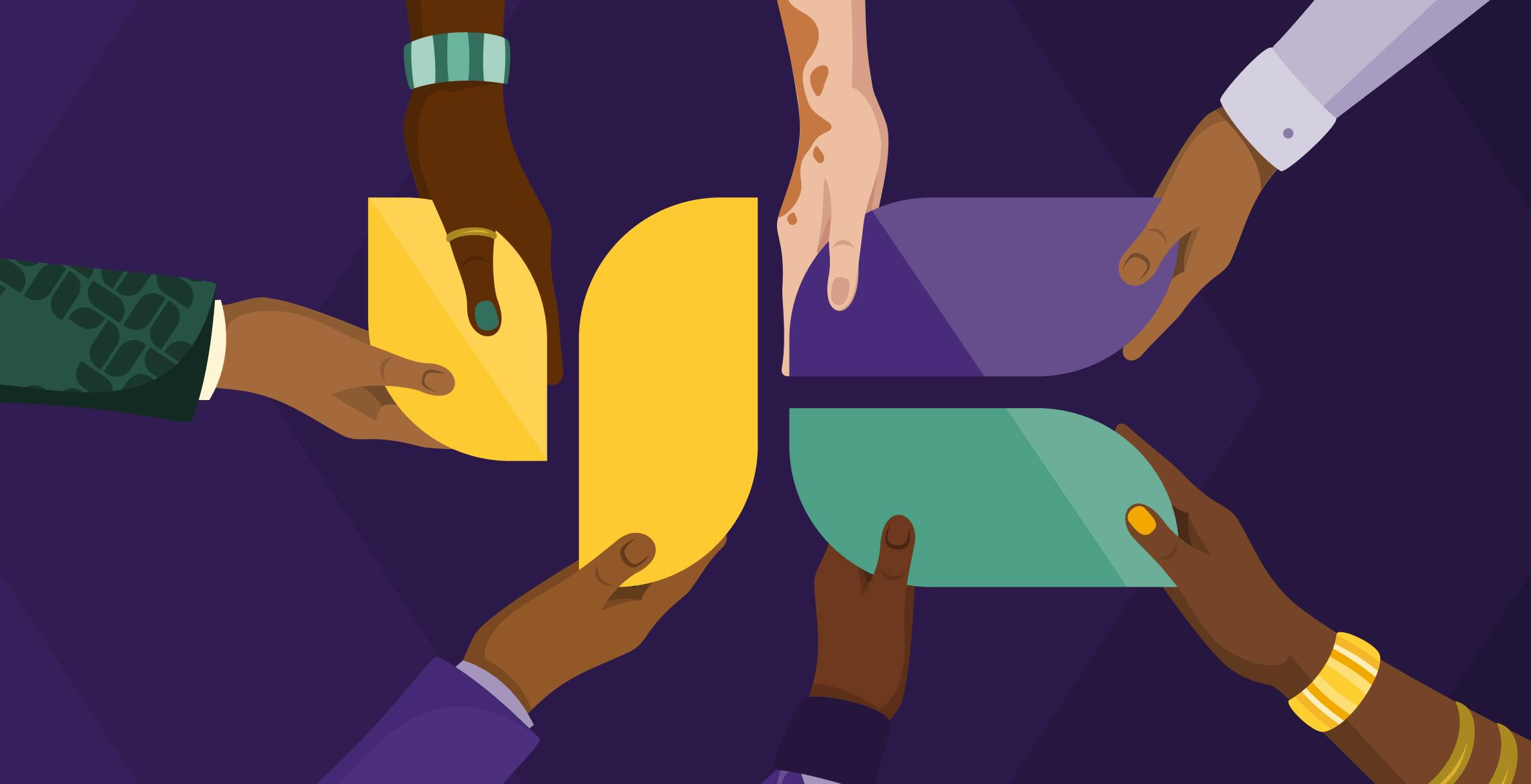
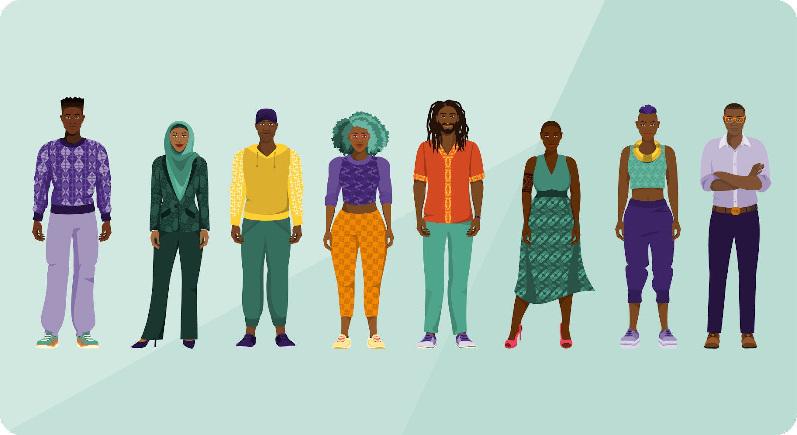
Yellow Card’s app has a wide reach across the African continent, giving us a varied and dynamic audience. From the outset we’ve aimed to reflect this diversity through our visuals, featuring varied characters in our product illustrations and marketing media. Since Yellow Card’s exciting rebrand last year, we’ve introduced characters that feel relatable, both for our team and for our customers. Our first set of characters explored diversity through a mix of genders, skin tones, eye shapes, and personal style. Listening to feedback from our team, we also chose very distinct personalities, professions and personal circumstances to represent our vast audience across Africa.
Having established a basis of how and why we create characters, the time had come for some bolder growth.
Diversity at an individual level
From my own experiences as a customer engaging with the brands around me, I knew that illustrations can have a subtle but profound impact on how we see the world. Having only a narrow segment of society represented, or not being able to identify with those depicted, can lead you to feel excluded and to subconsciously ask, “Am I welcome here? Are my friends welcome here?”.
On the other hand, the pure magic of seeing a varied group of people represented can make you feel that there’s definitely space there for you too. Even if you don’t personally face a physical disability of some kind, or aren’t part of what society deems a “minority”, seeing diverse representation can instil a feeling of openness and kinship that we all crave. We feel most welcome where all are welcome.
Diversity at a business level
We see our drive to include more diversity in our characters as an expression of Yellow Card’s vision of “financial inclusion for all”. Inclusivity isn’t only something that has a positive impact on an emotional level, it makes good business sense as well. Here are three examples of recent research conducted by major companies on the impact of inclusive content on customers’ experience and decision-making:
A Think with Google survey showed that people are more likely to consider, or even purchase, a product after seeing an ad they deem diverse or inclusive.
A study by Microsoft, showed that using an inclusive ad resulted in a marked increase in purchase intent, whether the person experiencing the ad felt represented in the ad or not. 70% of survey participants said they were more trusting of brands that represent diversity in their ads.
In another survey by Facebook, the majority of participants said they are more loyal to brands that stand for diversity and inclusion in online advertising, and are more likely to purchase from these brands.
Getting Started
As an illustrator, I was a bit daunted by the task of depicting disabilities or physical conditions.
It’s so easy to shy away with the excuse that you don’t want to offend anyone by portraying something incorrectly or with naivete. However, as I increasingly found accounts of how most people value representation in mainstream culture, the more determined I felt to make a start and improve from there.
Reading a few excellent articles on inclusivity in illustration (1, 2, 3) really inspired me to open this conversation with the rest of the team. We held a collaborative character design workshop with our three creative teams - Marketing, Media and User Experience. As we’re from a variety of countries and working in different disciplines, the workshop brought together a unique mix of perspectives. Everyone built out idea boards and also wrote a short bio for their character. Each board had a section for considering a physical condition of some kind. This ensured that we actively engaged with these concepts by bringing in our own experiences or insights.
Introducing…
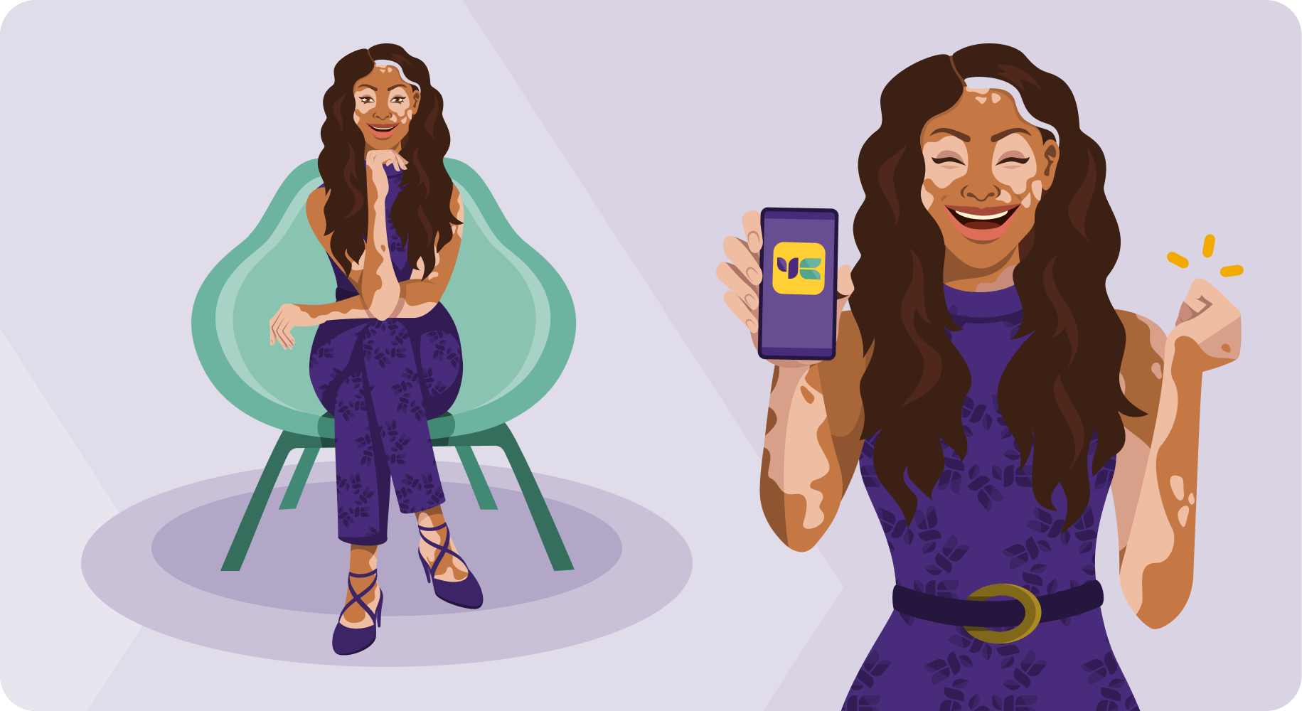
The workshop resulted in an exciting new personality, Ayana, joining our group of characters. The team’s ideas held such originality that we also generated a wealth of content that we will be exploring in the future. Watch this space!
Ayana has a fairly common skin condition called vitiligo which causes the loss of skin colour, and/or hair colour, in patches. If you’ve come across the incredible fashion model Winne Harlow, you’ll have seen a real-world woman with vitiligo who is not only comfortable in her own skin, but she’s redefining beauty in a very tough industry.
After finishing the designs for Ayana’s character, we felt that there were other good suggestions that could be implemented immediately. This led to making alterations to three existing characters. Now, looking at our group as a whole, we can see the changes have brought balance and more harmony. They feel less like characters and more like fully realised humans. Here are the changes:
Now, looking at our group as a whole, we can see the changes have brought balance and more harmony. They feel less like characters and more like fully realised humans. Here are the changes:
Lupita, who you’ve probably seen around, has moved from a close buzz-cut to being beautifully bald. Although of course anyone can shave their head, we wanted a closer reference for someone who has alopecia and can identify with a bald style. Lupita’s personality is vibrant and unapologetic, and we feel that this change gives insight into how and why she grew to be so.
Wanting to understand more: From our research we found that an estimated 140 million people throughout the world will experience alopecia (which can be hair loss on your scalp or entire body) in their lifetime. Research shows that black people are more likely to be affected than Asian, white or Hispanic people.
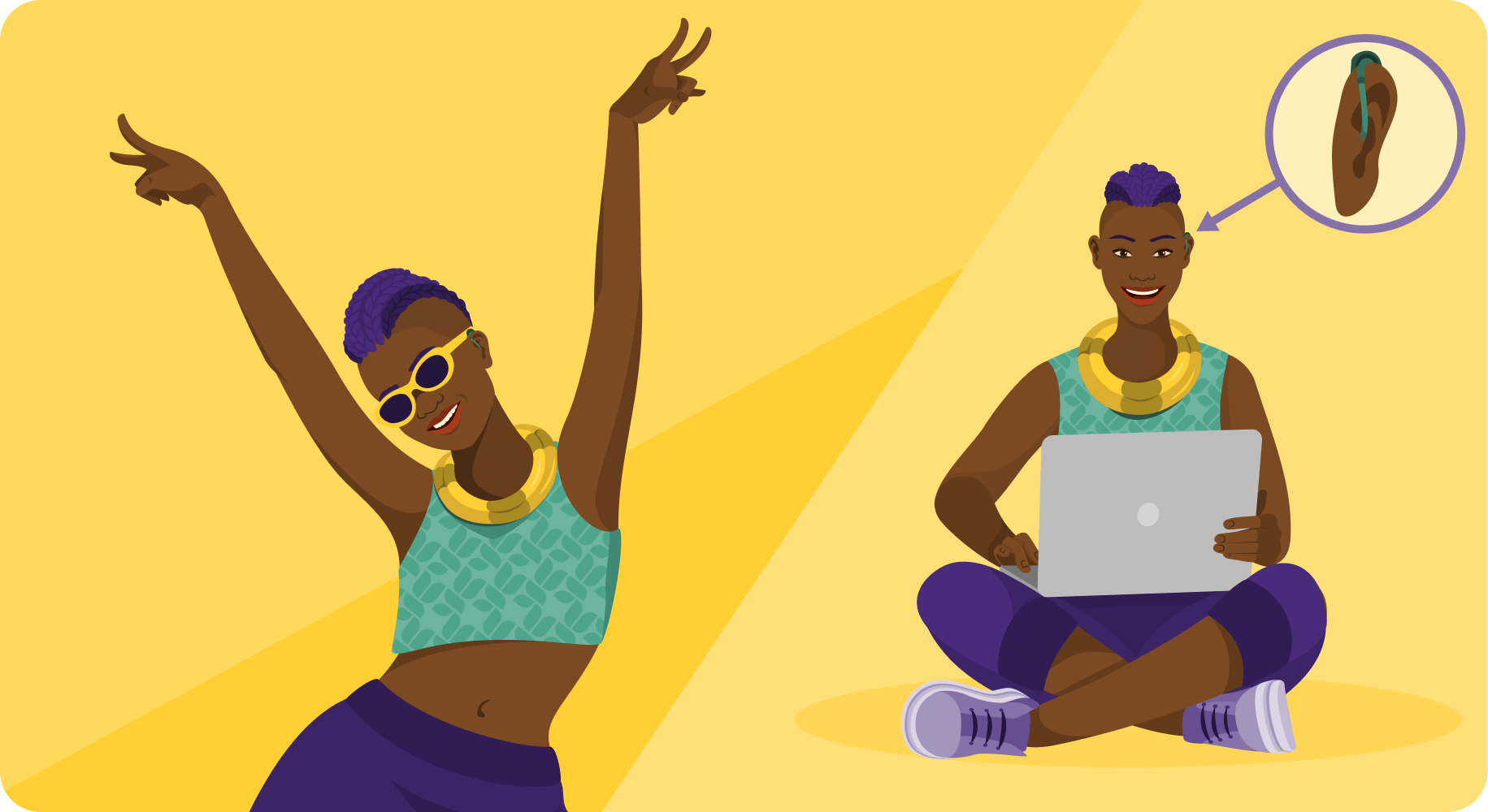
Ruji’s is a very subtle change: she now has a hearing aid in one ear indicating that she has partial hearing loss or difficulty. This may seem like a small change, and one that not everyone will notice, but if you wear hearing aids or one of your loved ones does, we hope you’d spot it and enjoy the representation. Ruji is often depicted celebrating and being joyful. Her openness and positivity are skills that she’s needed to consciously cultivate as she’s learnt to navigate the world with hearing loss.
Wanting to understand more:
In our research we found that currently more than 1.5 billion people (nearly 20% of the global population) live with hearing loss, and 430 million have disabling hearing loss.
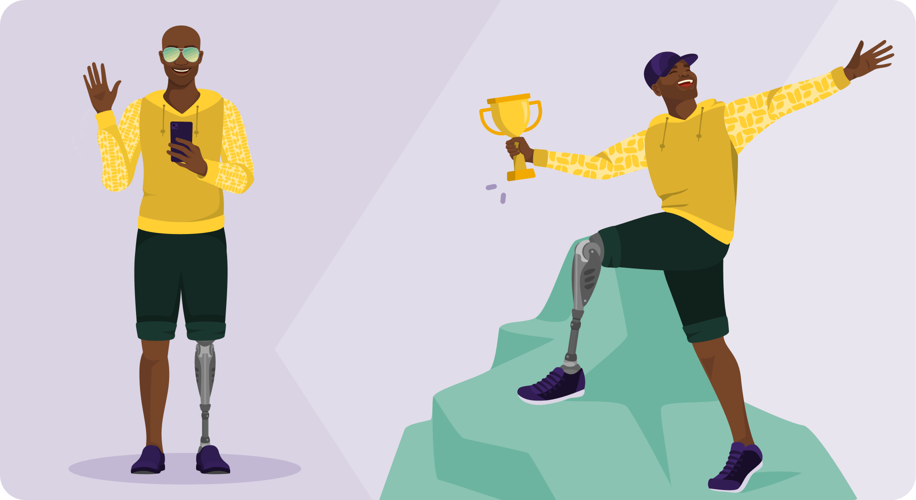
Lastly we have Tiyo. He’s a character we haven’t seen full-length before, so there was the opportunity to include a more obvious change with an artificial lower leg. In learning to live life to its fullest despite the challenges he faces, Tiyo has become resourceful and patient. He’s humble, but he’s one of the most confident people you’ll meet as he lives his life on his own terms.
Wanting to understand more:
In our research we found that globally an estimated 65 million people live with limb amputations, and 1.5 million people undergo amputations every year. Around 5 million of the amputee population live in Africa.
When sharing these changes and additions with our wider team internally, they were met with a rain of happy emoji’s (we’re a fully remote team, emoji’s are our love language 🥰). People reached out to say they saw friends and family represented through these ideas, and that was really important to them. It’s also what makes our work as a creative team inspiring and meaningful. On an emotional level, we want to uphold our company value of openness, and on a practical level as a brand, we feel inclusion in 2023 isn’t just important, it’s essential.
Ready for More
Through illustration we can make choices for the future that we want to see, for ourselves and for those around us. As the world becomes more connected, and we all become more aware of one another, we’ve seen a clear focus on diversity, inclusion and body positivity. This is really an area where we’re building a better world where we choose to be curious, and to celebrate and enjoy our differences.
As these illustrations make their way into the world, we invite our customers to share their thoughts: Where can we improve? What would you like to see? We can’t promise perfection, but we will certainly always show up with openness and enthusiasm.
Melany Hodgson
Digital Illustrator
