New Look, Same Mission: Introducing Yellow Card’s Rebrand Story
YC Updates
Back to blog
Sarah
July, 29 2022

YC Updates
Intro
It’s been an eventful few months here at Yellow Card, as we successfully raised our series A funding, nearing our 1 millionth customer joining, and launched in 16 countries across the continent.
But that’s not all! We’ve built out a new brand style that reflects our customers and our company values. This will allow us to offer access to even more customers in the coming years.
It is with great pride and joy that I share with you all that Yellow Card is changing, but don’t worry, it’s all for the better!
“But nobody likes change” I hear you say… well, fear not. We aren’t changing any core functionality of our app, we’re just making it more accessible, playful and inclusive for all our beautiful customers, like yourself!
But why?
While our current brand has got us this far, we’re now reaching for the next chapter, so we needed our brand to feel fresh, approachable and professional.
We held an internal, cross-functional workshop to uncover the pain points we had with our existing brand, and decided to create a brand that’s diverse, inclusive, young & fresh, yet still exudes sophistication, just like our customers.
What’s changing?
The logo: Customer feedback highlighted that our existing logo did not align with who we are as a company so we decided to change our logo and app icon.
Colours: Yes, we’re called “Yellow Card”, so yellow will always be our primary colour. However we realised that we needed to expand on our colour palette to create a broader visual identity.
Fonts: OK, OK, I must admit, this one was fully on the design team. We felt our existing font “Gordita” was outdated and lacked character (‘scuse the pun). We knew we could do better!
Illustration: Wait, what? Yellow Card have their own illustration style? Well, no, not until now! So we decided in order to create a strong brand, we needed to come up with an illustrative style that encompasses who we are as a brand, and we wanted to do it all in-house.
Tone of voice: We want our written communication to feel familiar and warm, and let our customers know that they belong, are valued & seen.
So without further ado, I introduce you to our new brand:
Tell me more
If that video wasn’t enough to whet your appetite, allow me to take you on a journey through our new brand and explain why we made these decisions.
Logo
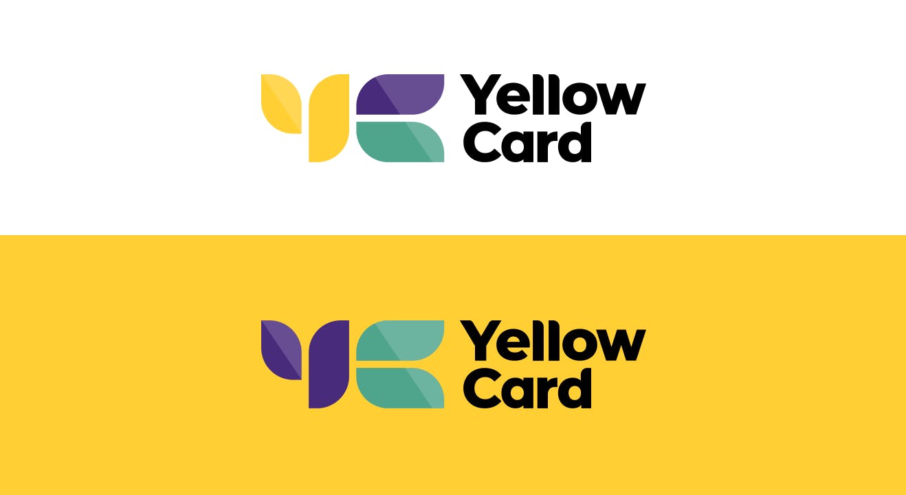
We felt this logo reflects our playfulness, diversity and inclusivity. The leaf-like shapes that make up the “Y” and “C” of our logomark allude to the idea of growing financial gains, which ties in beautifully to crypto and our vision of financial inclusion for all. During our brand workshop we felt the importance of creating patterns as brand elements, not only to expand our identity, but to incorporate an African aesthetic, and this logo allows us to create our own brand elements as patterns, using the logomark.
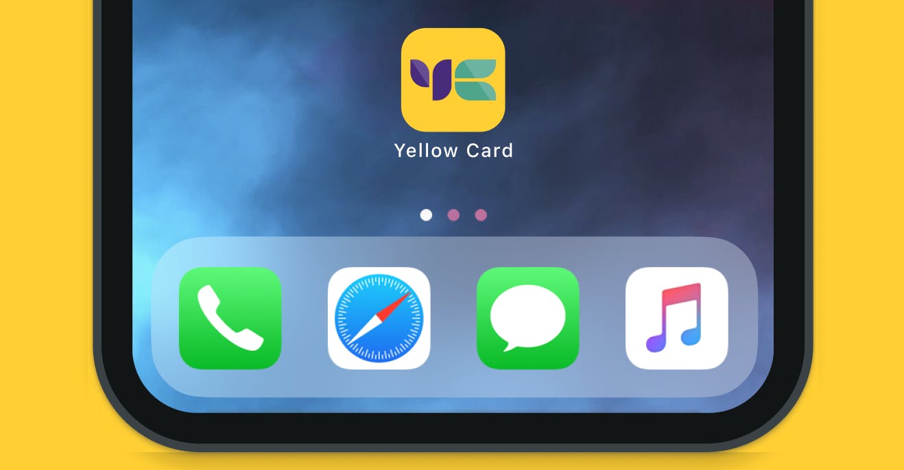
App Icon
Our app icon has now changed to our new logomark, and this will also be reflected in our social media profiles.
Colours

New Yellow Card colours
While our primary colour will remain yellow, we have incorporated secondary colours of purple and teal to compliment our primary colour.
The yellow: our brand cornerstone. We made it slightly brighter, with less of an orange tone. We felt this shade of yellow was more young, playful, yet sophisticated and resembled that urban, tech-savvy customer.
The purple: It’s deep, rich, bold, and full of spirit, evoking images of wealth and royalty.
The teal: We decided on the teal to soften and compliment the yellow and purple. It’s warm, welcoming and fresh.
Fonts
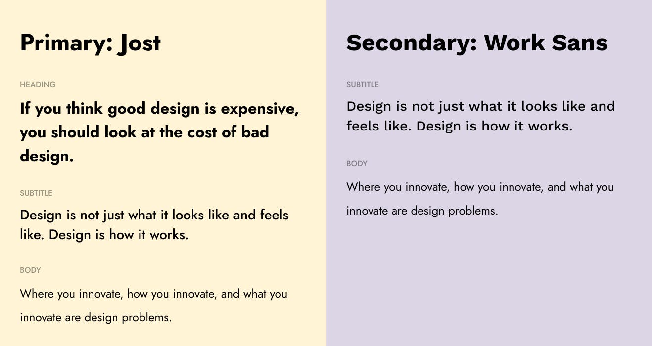
We decided on the font “Jost” as our primary font as it has an element of vibrance and personality to it, compared to our old font. We included a secondary font, “Work Sans” for extra brand flexibility, and best readability on long-form copy.
Illustration
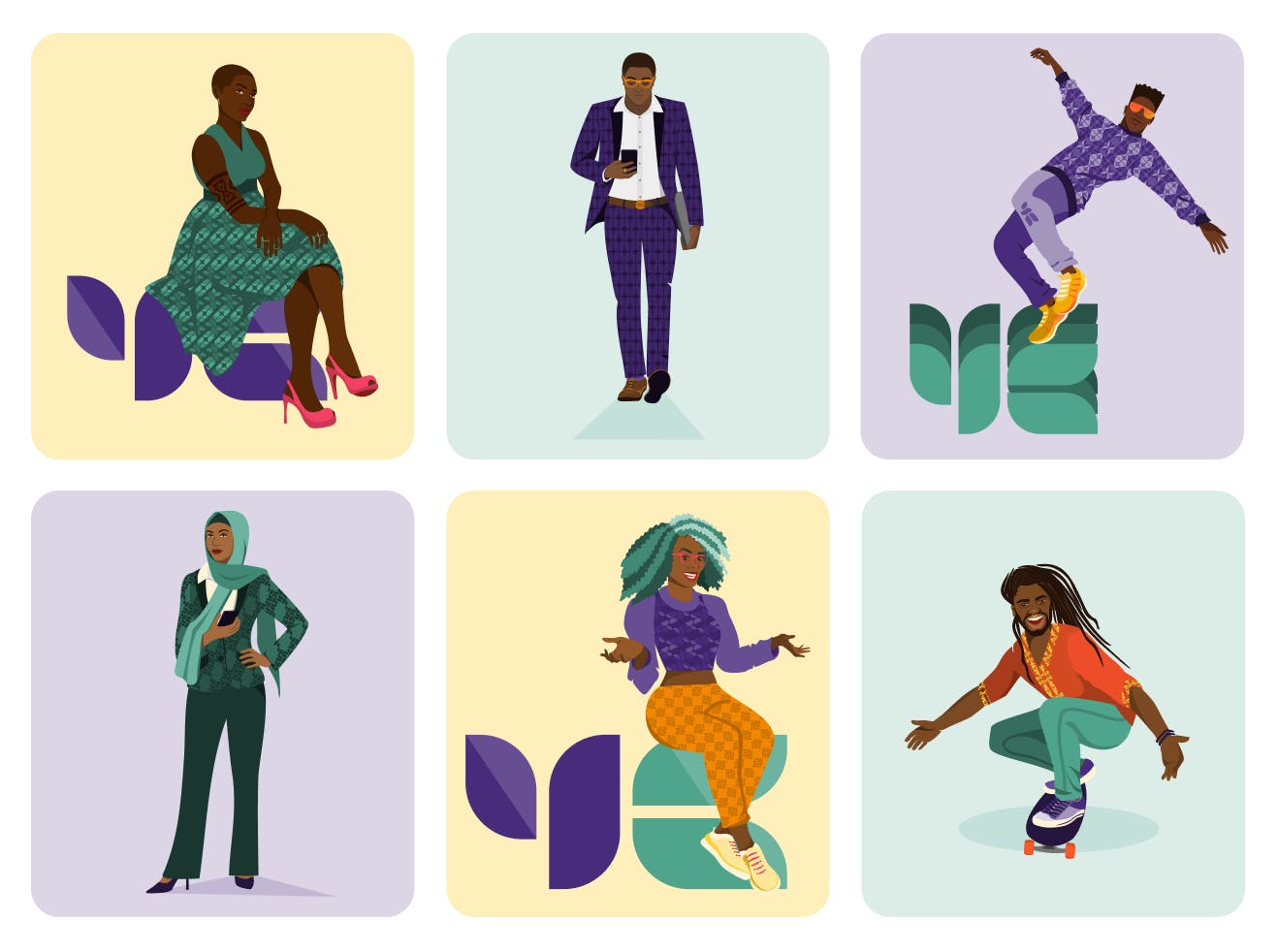
As mentioned, we didn’t have our own illustrative style before this rebrand. During our brand workshop we realised we needed to create an illustrative identity that’s down-to-earth, realistic and relatable. We wanted to create characters that are easy to relate to, playful, energetic, and a little bit edgy, drawing inspiration from the personality of the Yellow Card team itself!
Patterns
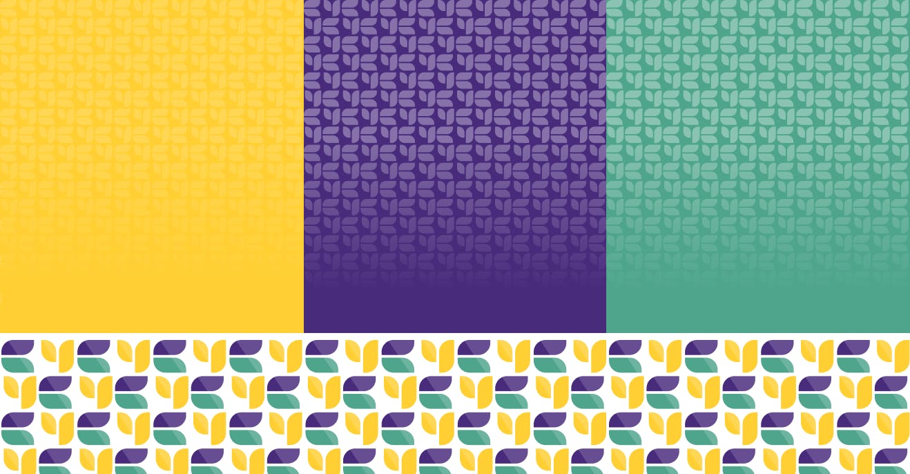
Using our logomark, we now have patterns that can be used as brand elements to support our brand story. Fun fact: these patterns feature in different colourways on our illustrated characters' clothing!
Tone of voice
Our voice is human. We speak with a positive, but well-informed voice that inspires trust, letting you know that you belong. We created a brand tone of voice spectrum which is playful, yet respectful. Accessible, yet insightful. Bold, yet assuring. Empathic yet factual, and global, yet local. This allows us more room to flex our brand voice across different channels.
To wrap up
This was a gigantic joint effort between product, marketing, design & our media team, and I couldn’t be prouder to work alongside such incredible talent. We hope you enjoy our new brand identity and tell all your friends and family about it!
If you are a product designer and think Yellow Card sounds like an awesome place to work (call me biased but I think so), then check out our Careers Page for current openings.
Sarah Paterson
Director, Design & UX
Share this article