Onboarding Africa: Simplifying our sign-up
Inside YC
Back to blog
Osagie Osagiede
April, 22 2024
Inside YC
On this page
Why is onboarding so important?
The Old Landscape
Listening to our customers
Out with the old and in with the new
The Results?
Wrapping up
Share this article
How do we, as a company in over 20 countries, design with localisation in mind? We’re diving into the heart of our design process, exploring how we simplified and enhanced our account creation flow for a seamless and delightful experience.
But first, let me introduce myself: My name is Osagie Osagiede. I am a product designer at Yellow Card for the Onboarding and Basecamp pods. I graduated from university with a Bachelor’s degree in Electrical/Electronics engineering, but I have always been interested in creative arts and media. This interest led me to the path of design with a focus on User Experience at Yellow Card.
Why is onboarding so important?
Onboarding is the essential process through which customers are introduced to and guided through the process of creating an account. It is the virtual handshake, the warm welcome, and the journey rolled into one. At Yellow Card, our onboarding serves as the first step to your financial journey as you become familiar with the features, functionalities and security measures. Think of it as the first impression that sets the tone for a whole new experience — where simplicity, clarity and financial inclusion converge to ensure customers feel confident and equipped to make their money move effortlessly.
So, onboarding is super important in gaining customers' trust in financial services. It sets the tone for future interactions between the customers, the product and the company and, in a couple of minutes, influences a customer’s decision to become a regular.
According to McKinsey research, “The majority of banked customers, 67 percent, still say that they trust their bank more than fintech. However, trust in fintechs is growing, particularly among lower-income segments, with 51 percent of youth and mass-market customers saying they trust fintech about the same as they trust banks.”
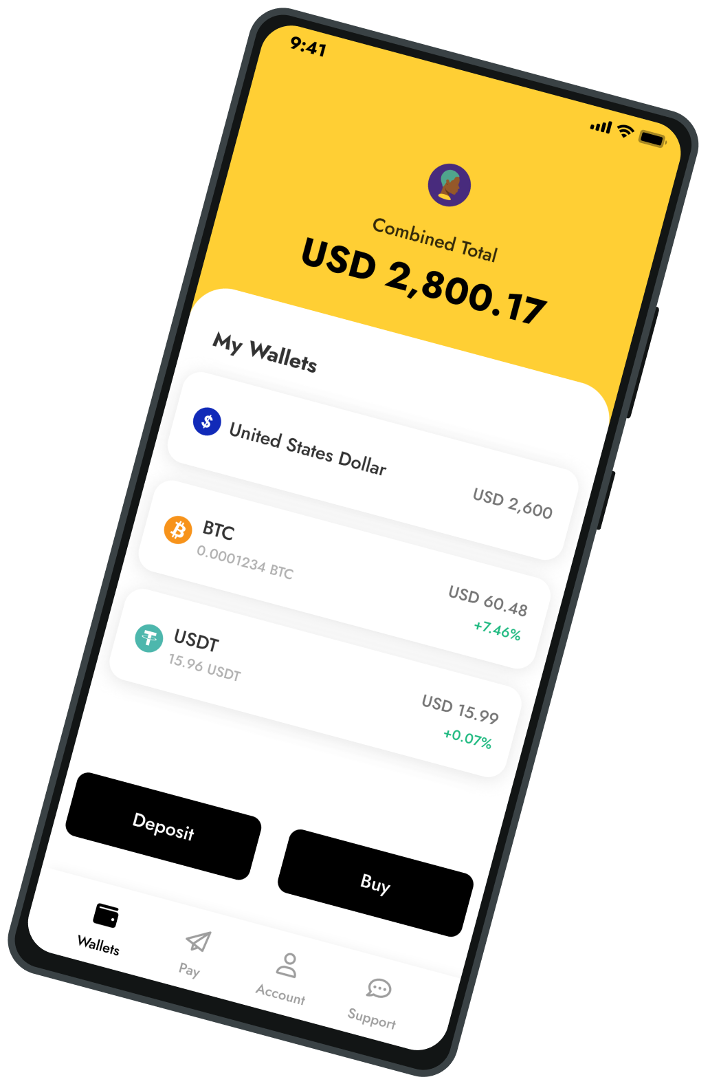
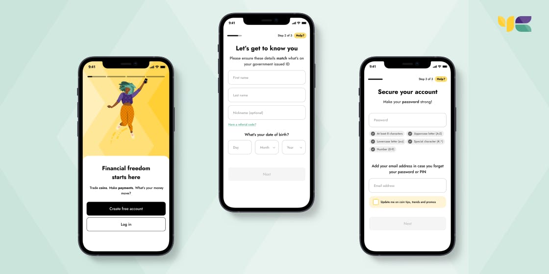
The Old Landscape
In the not-so-distant past, our onboarding process took customers through multiple screens, was less localised for our diverse markets, needed to be more visually appealing, and needed a few UX improvements.
Old onboarding flow on the Yellow Card app
Listening to our customers
The first step in our transformation journey was listening — truly listening — to the feedback from our customers. With the help of our UX Researcher (Ryan Jales), we conducted usability testing, gathered feedback through surveys, and even monitored support channels to understand pain points and areas needing improvement. This customer-centric approach became the cornerstone of our redesign.
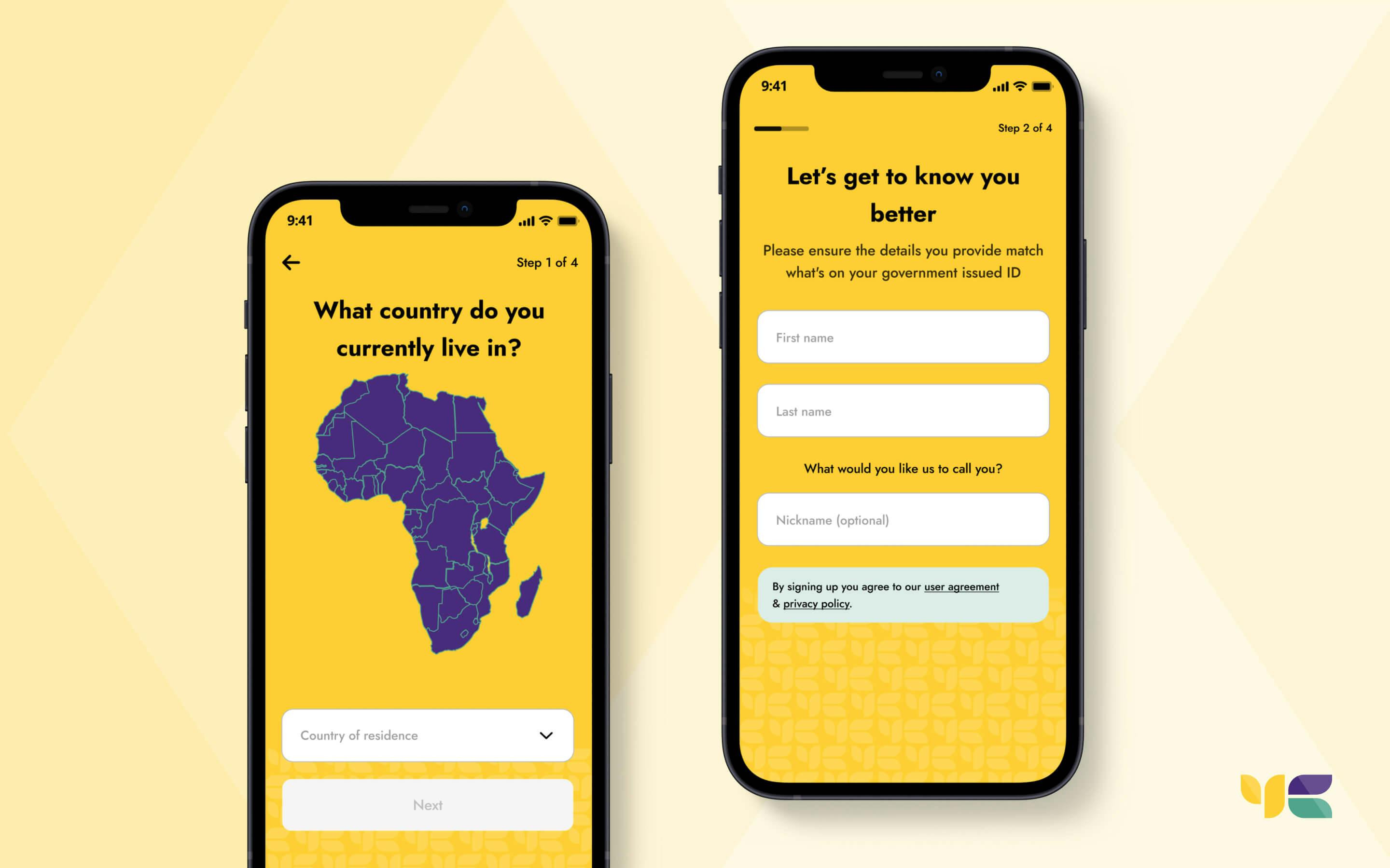
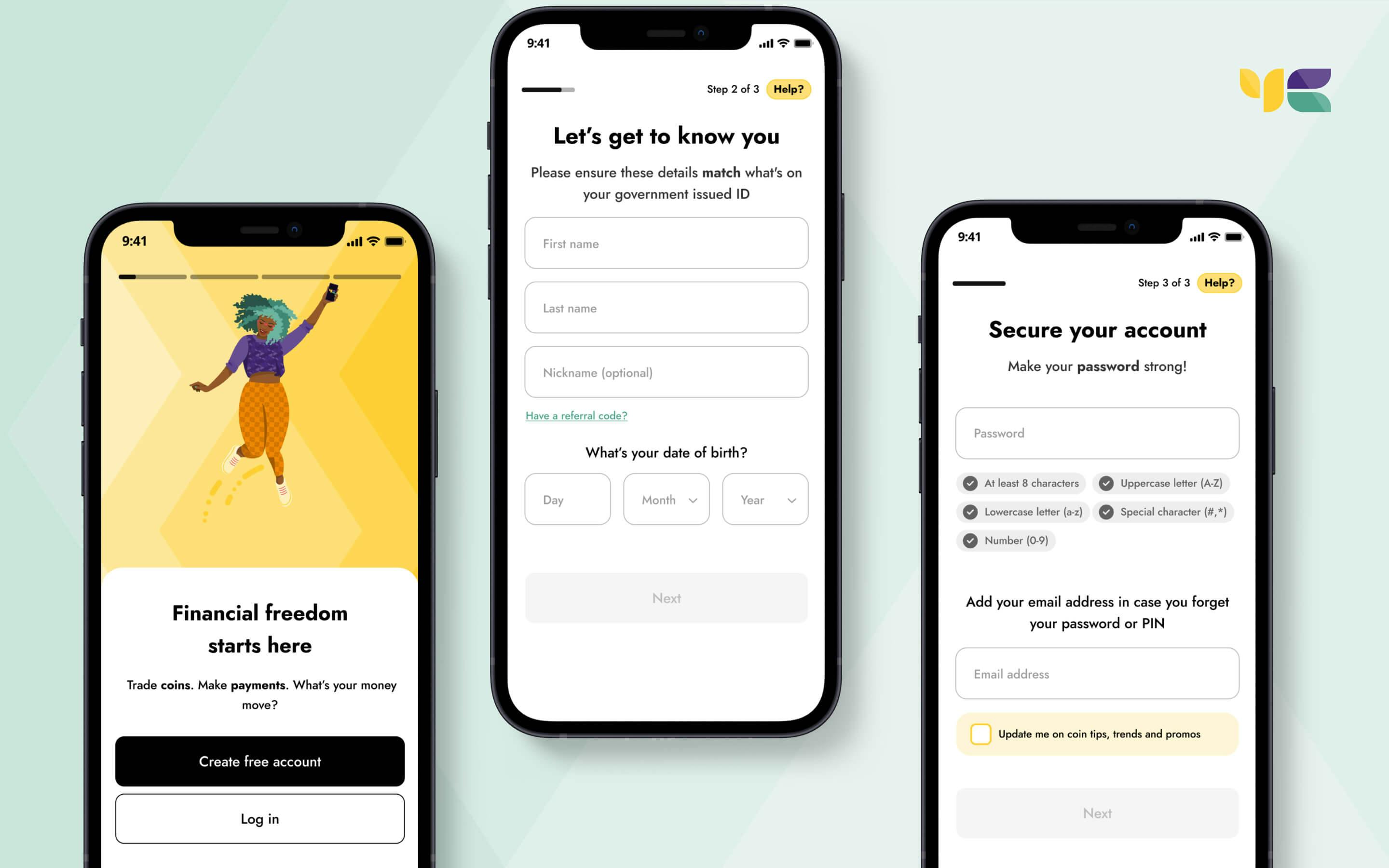
Out with the old and in with the new
So, what changed in the new onboarding flow? Our success metric was for customers to sign up seamlessly and with the least amount of friction, ultimately shortening the steps and reducing the time to completion and conversion for customers.
- Embracing simplicity
Armed with insights, we embarked on a mission to simplify. We took a step back, stripped away unnecessary complexities, and reimagined each step of the onboarding process by grouping similar items that customers can relate all together (Law of Proximity). With the help of our Product Illustrator (Melany Jane), who held a colour theory workshop, we even changed the dominant yellow to a cleaner white background so as to reduce cognitive load, giving ease to the flow - Clear Onboarding Guides
We introduced onboarding guides that lead customers through the platform. This approach clearly explains our product and unique selling points early on when you create an account while also making it memorable and engaging. - Intuitive design at the Helm
Our design team embraced the power of intuition. We restructured the onboarding flow with a focus on natural customer behaviour, ensuring each step felt like the next logical move while keeping stringent to our requirements on the create account process.
The process aims not to be too time-consuming or complicated, resulting in customers dropping off or losing interest in our product. The main point here is to minimise the effort by customers to start using the product and also with the least amount of friction — you get to see the metrics currently as you go along reading.
New onboarding flow on Yellow Card app
Little changes that brought it all together
- Making the account creation process really seamless and easy for customers with a touch of localisation.
- Introducing new brand visuals and illustrations to portray our brand tonality and identity — S/O to our Product Illustrator (Melany Jane)
- Including the phone number early on in the flow reduces drop-off and frustration from customers who might have meant to log in instead of creating a new account.
- Grouping requirement process that aligns with the same information to be provided — having the full name and Date of birth on one screen, having customers input their password and email address on another.
- Following our customers' progress during their onboarding, add contextual help, and manage expectations throughout the process.
- Localised greetings for our 20+ African customer demographics on the flow create a warm welcome for our new customers on their financial journey.
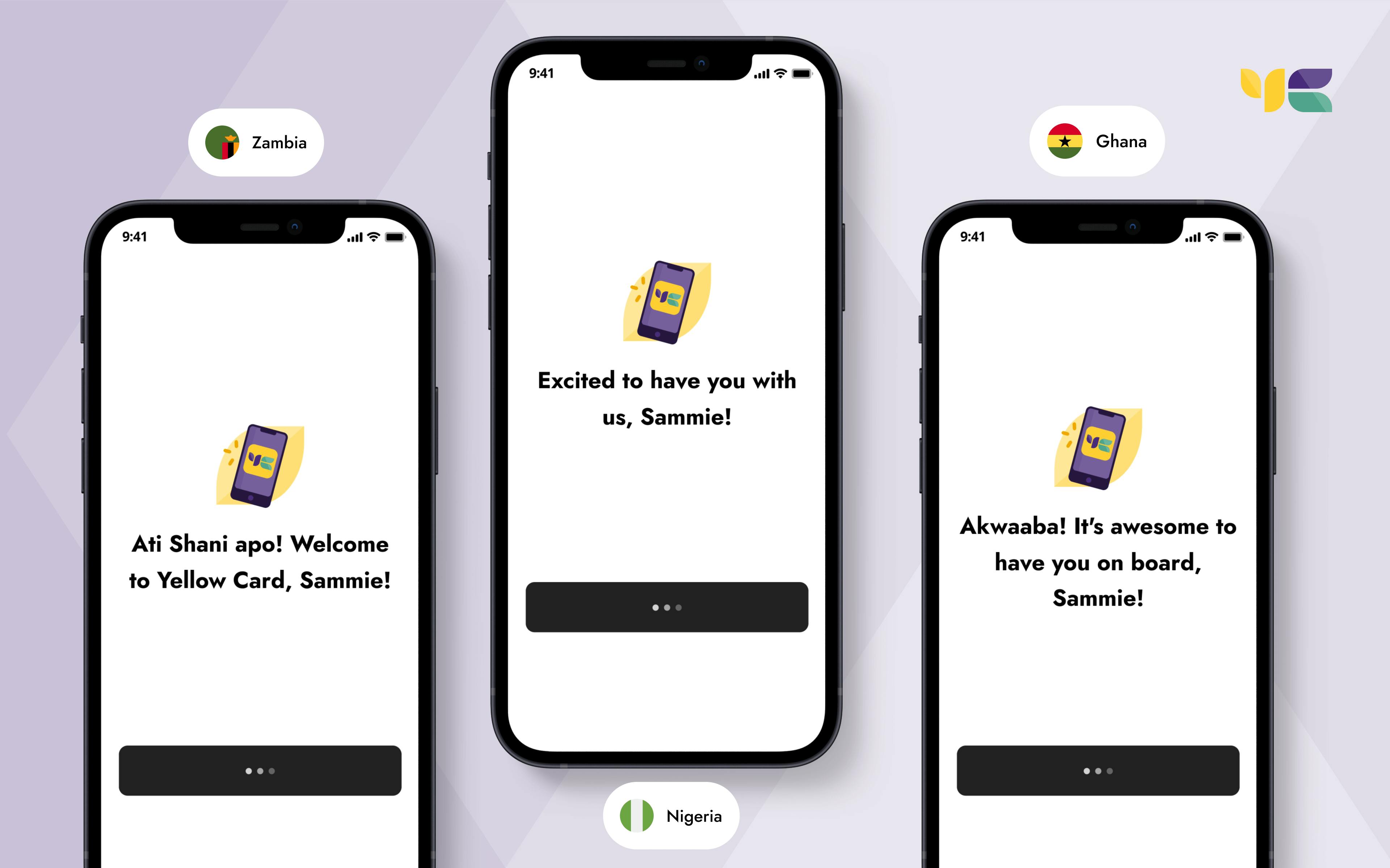
Localised greetings for our different African markets
The Results?
We have measured the tremendous impact of our onboarding overhaul, which has been nothing short of remarkable. Customers praise a job well done for listening and implementing substantial changes, and we witnessed a significant reduction in drop-off rates during onboarding as well as a decrease in the time to completion of the new onboarding flow. Customers not only appreciated the simplicity of our platform but also felt more confident using it.
From our metrics, we have recorded a 23% reduction in the time it takes to complete the onboarding flow and also seeing a 4.4% increase in conversion rates.
Wrapping up
The journey doesn’t end with a single redesign. We have embraced a culture of continuous iteration. Regular feedback loops, usability testing, and post-onboarding surveys help us stay in tune with our customers' evolving needs, ensuring that our onboarding process remains enjoyable and functional as they move their money through Yellow Card, trusting us with their financial freedom!
Special recognition to our Director of Design & UX (Sarah Paterson) for working on this amazing change to our product, working alongside our Lead UX Content & Research Strategist (Ryan Jales) as well as our Product Illustrator (Melany Jane), combining all collaborative efforts with the team.
Osagie Osagiede
Product Designer, Yellow Card.
Share this article